Carets stayed
Changing them meant new permissions.
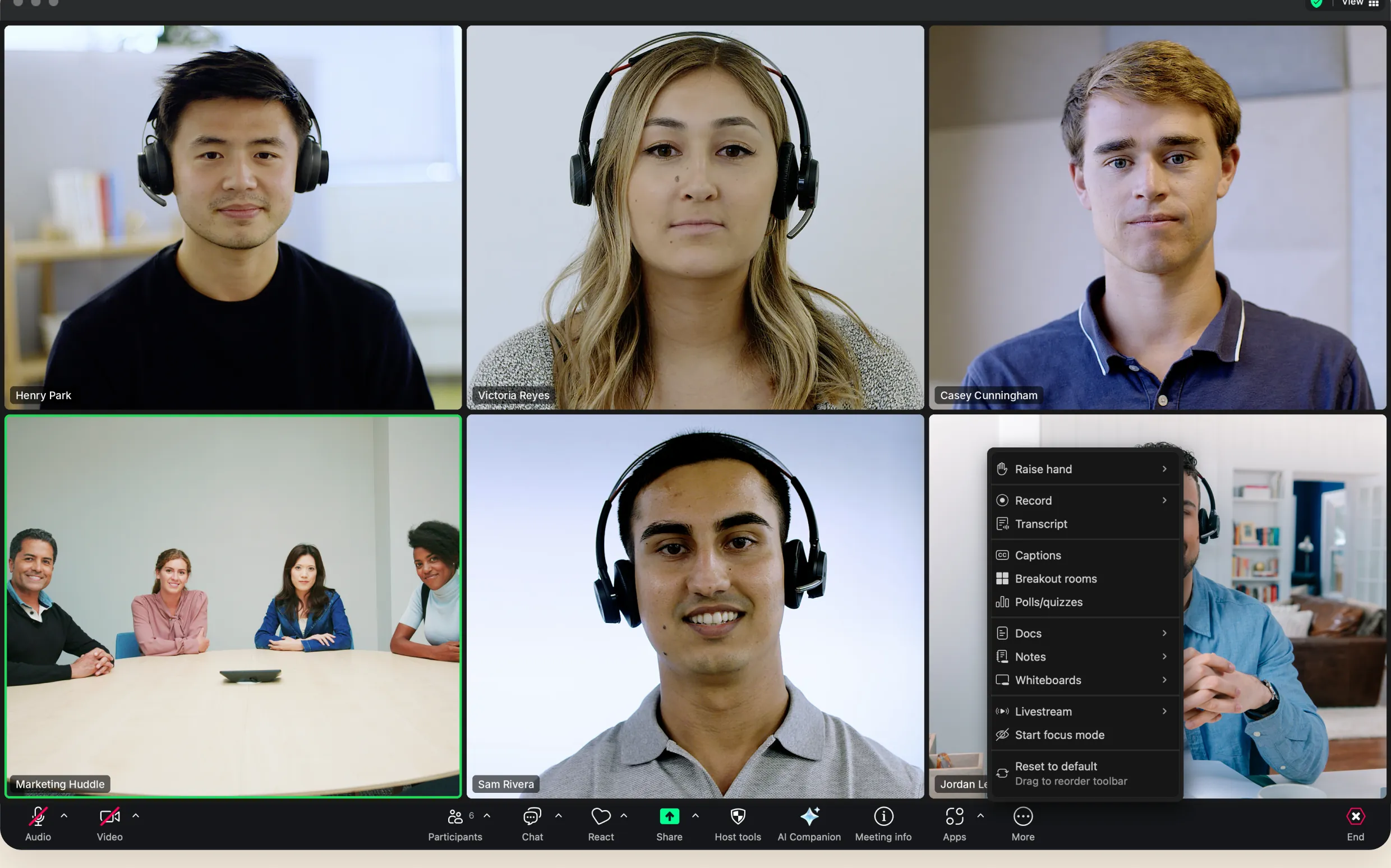
Zoom’s first full redesign in a decade: new navigation, visual hierarchy and meeting UI for a product 300M+ people use every day.
300M+
people a day, across every role: admins, hosts, participants
every device, phones to car screens to Zoom Rooms.
The problem
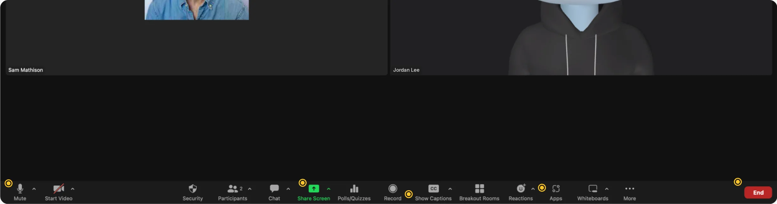
Up to 23 buttons plus a More menu. Hosts trying to leave ended the meeting for everyone 40% of the time.
Discovery + research
Week 1
Week 2
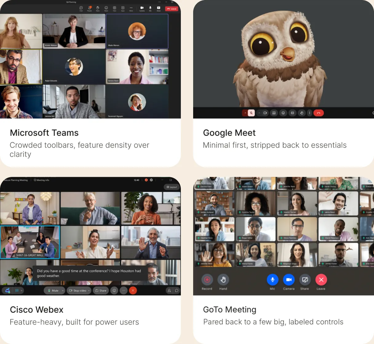
From novice to power user, the goal was to validate and rank what was actually broken.
20user interviews
Top problems we heard
Confusing, cluttered navigation
Too many distractions create tunnel vision
The system
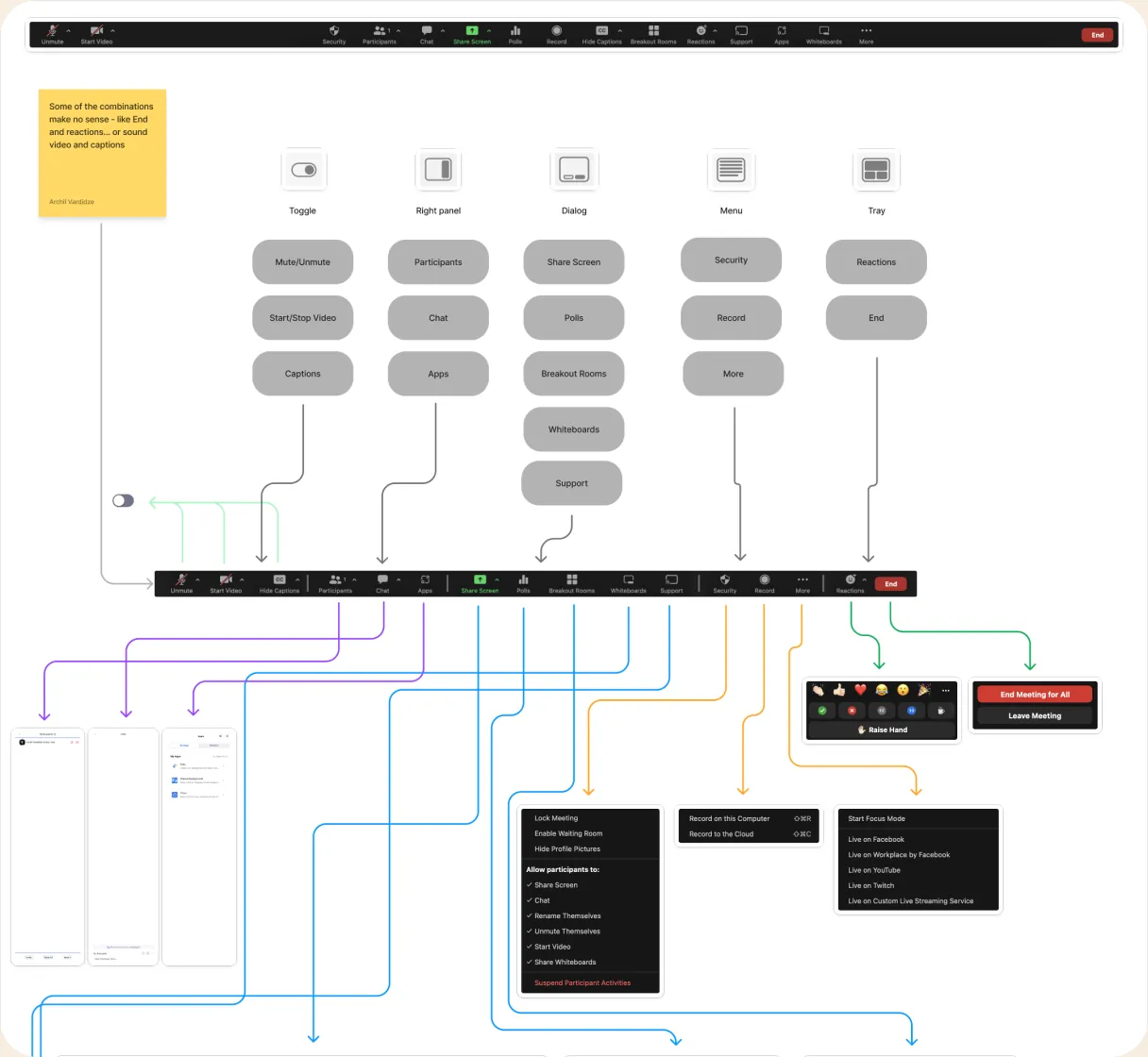
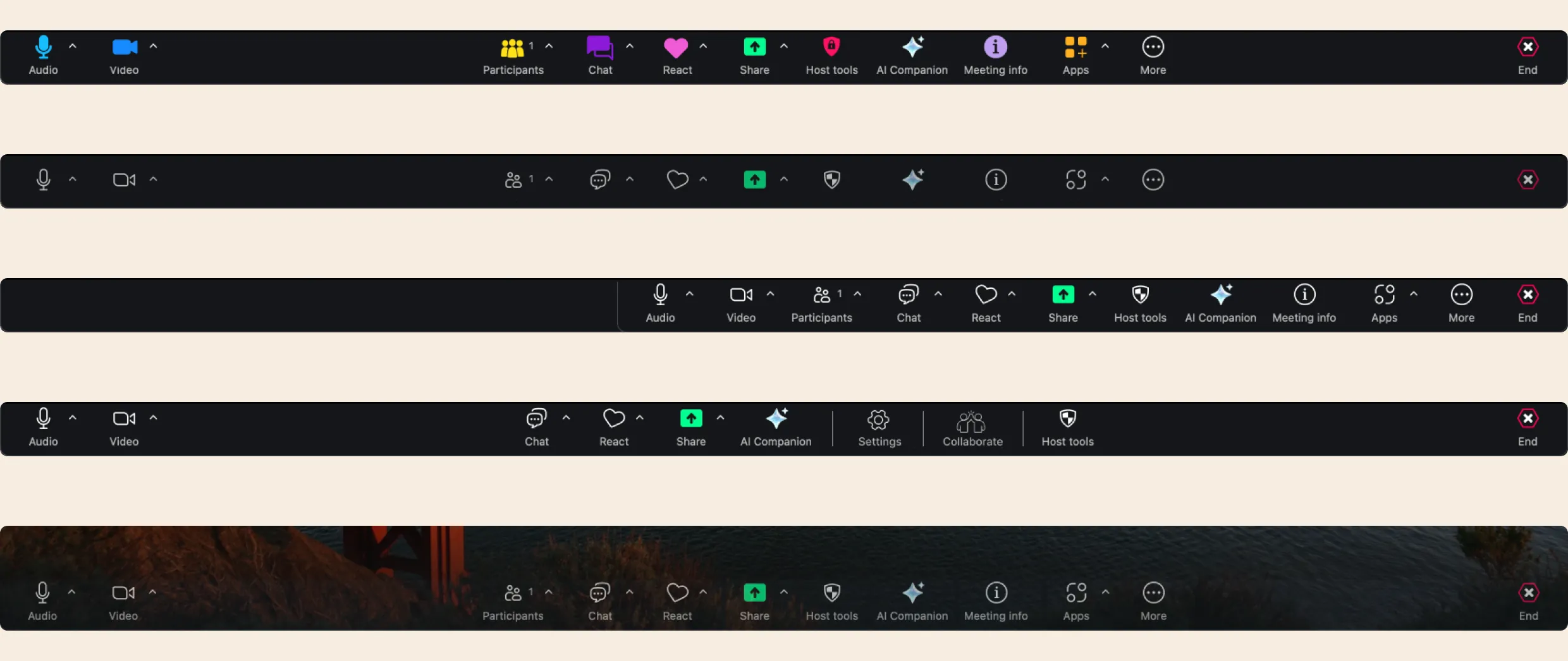
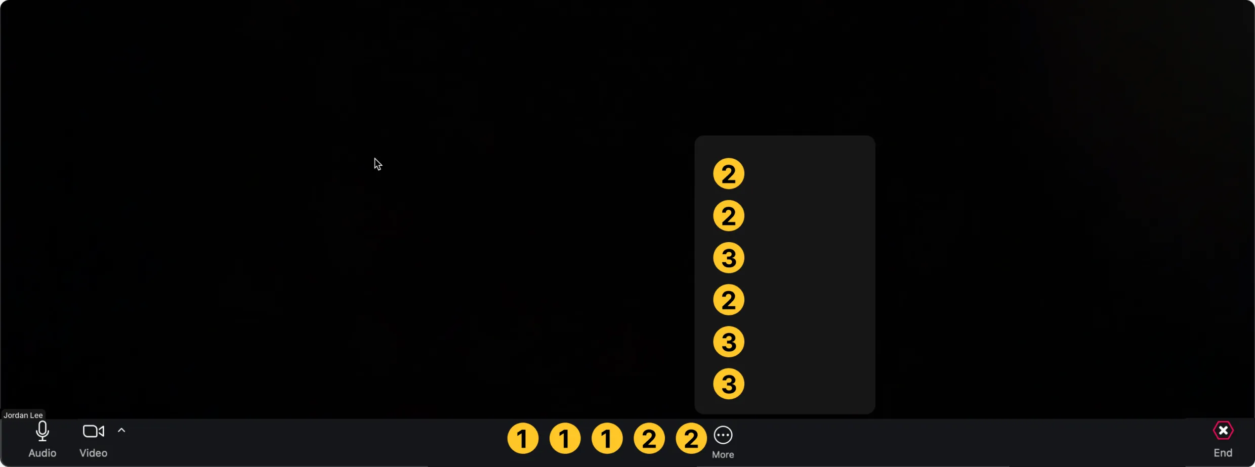 TIER 2Often neededUsed in over 30% of meetings. Usually grouped in More, with exceptions like Chat and React kept in the toolbar when speed matters.Chat · Captions · React · ShareTIER 2Often neededUsed in over 30% of meetings. Usually grouped in More, with exceptions like Chat and React kept in the toolbar when speed matters.Chat · Captions · React · ShareTIER 3Nice to haveUsed in under 30% of meetings. Lives in More, grouped by context.Docs · Notes · AI Companion · Record · WhiteboardsTIER 2Often neededUsed in over 30% of meetings. Usually grouped in More, with exceptions like Chat and React kept in the toolbar when speed matters.Chat · Captions · React · ShareTIER 3Nice to haveUsed in under 30% of meetings. Lives in More, grouped by context.Docs · Notes · AI Companion · Record · WhiteboardsTIER 3Nice to haveUsed in under 30% of meetings. Lives in More, grouped by context.Docs · Notes · AI Companion · Record · Whiteboards
TIER 1Must-havesUsed in over 60% of meetings. Always in the main toolbar.Audio · Video · Participants · More · EndTIER 1Must-havesUsed in over 60% of meetings. Always in the main toolbar.Audio · Video · Participants · More · EndTIER 1Must-havesUsed in over 60% of meetings. Always in the main toolbar.Audio · Video · Participants · More · EndTIER 2Often neededUsed in over 30% of meetings. Usually grouped in More, with exceptions like Chat and React kept in the toolbar when speed matters.Chat · Captions · React · ShareTIER 2Often neededUsed in over 30% of meetings. Usually grouped in More, with exceptions like Chat and React kept in the toolbar when speed matters.Chat · Captions · React · Share
Explore + design
The best direction was the least surprising one. People kept the layout they knew, usage data decided what stayed up front, and End stopped being the scariest button on screen.
Shipping
The launch date was Zoom’s annual conference, so every cut had to earn its place. We gave up a few ideals to hold the date, and customization made up the difference.

Changing them meant new permissions.
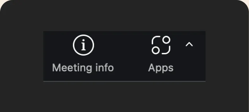
Out, then back in at the last minute.
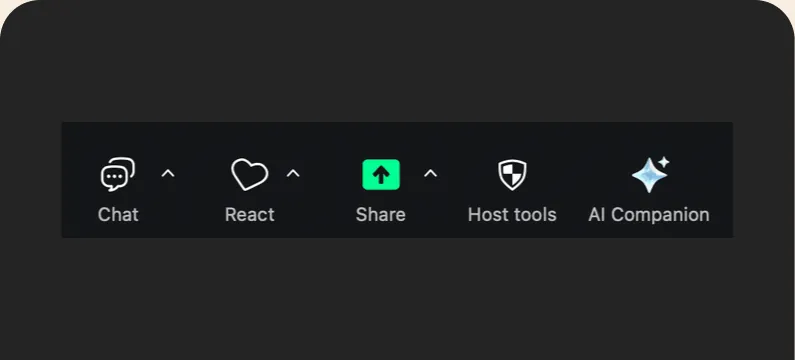
Too risky for our tech stack.
What shipped
Drag-and-drop customization was the big win against clutter. People choose what lives in their toolbar, and the rest moves into More.
Mobile
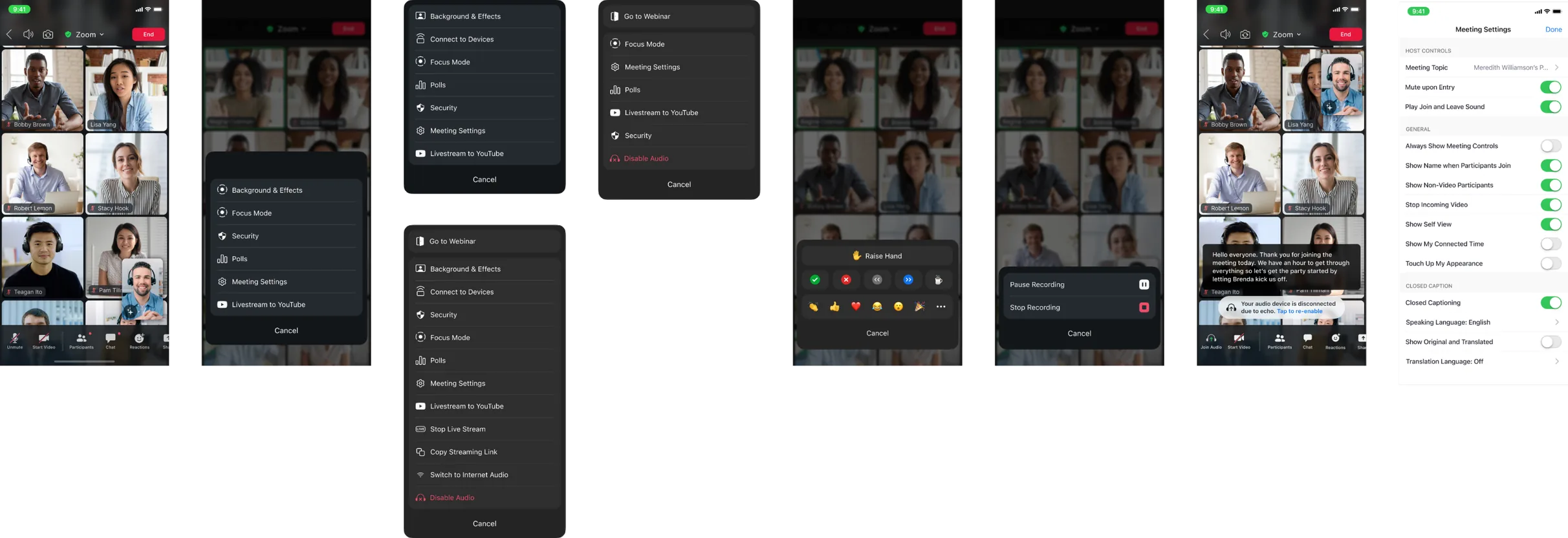
The same tiers carried over to mobile. Core controls stay in the bottom bar, and everything else lives in half sheets sized for one thumb.
The result
30%
lift in customer satisfaction in three months, with almost no complaints. A quietly raging success.
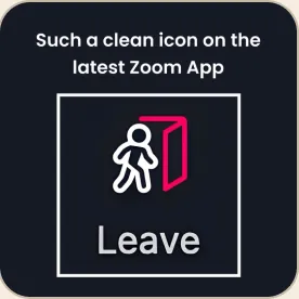
“The line icons in the latest version of Zoom are so clean and nice.”
What I took away
We didn’t ship everything we proposed, but the tier system, drag-and-drop capabilities and new patterns gave every team after us solid ground to build on.